2.4 Graphing Functions and Specific Predictions
Adding Functions to a scatter plot
Although we already have a perfectly fine way of adding a linear function to a scatter plot (gf_abline()), we can also directly add the custom R function we created (our_function) to a graph using gf_function(). This is good to know because we can use it to graph more complex functions later (i.e., not just straight lines). (Notice how we’re always trying to prepare you for future learning?)
Here’s an example of code that adds our_function (in steelblue color) to the scatter plot of flipper length predicting body mass:
gf_point(body_mass_kg ~ flipper_length_m, data = penguins) %>%
  gf_function(our_function, color = "steelblue")
Try adding our_function to the graph in the code block below. Then, if you want, change our_function to be your own model by modifying \(b_0\) and \(b_1\).
require(coursekata)
# this creates our custom function
our_function <- function(X){-5.5 + 49*X}

# add our_function to this graph
gf_point(body_mass_kg ~ flipper_length_m, data = penguins) %>%
  gf_function( , color = "steelblue")
# this creates our custom function
our_function <- function(X){-5.5 + 49*X}

# add our_function to this graph
gf_point(body_mass_kg ~ flipper_length_m, data = penguins) %>%
  gf_function(our_function, color = "steelblue")
ex() %>% {
    check_function(.,"gf_point") %>% {
        check_arg(., "object") %>% check_equal()
        check_arg(., "data") %>% check_equal()
    }
    check_function(., "gf_function") %>% {
        check_arg(., "object") %>% check_equal()
    }
}
Adding Function Predictions to a scatter plot
We can also use our custom R function to add individual predictions for specific values of \(X\) to a scatter plot. We will use the pipe operator to overlay a prediction using the gf_point(Y ~ X) function. But this time we’ll use our custom function to help us with the Y and X.
Note that we can use the code our_function(0.22) as a stand-in for Y, because if we evaluate the function, the result will be a prediction for Y.
Here’s an example of code that will add this prediction as a red dot on top of the scatter plot of flipper length predicting body mass:
gf_point(body_mass_kg ~ flipper_length_m, data = penguins) %>%
  gf_point(our_function(0.22) ~ 0.22, color = "red")
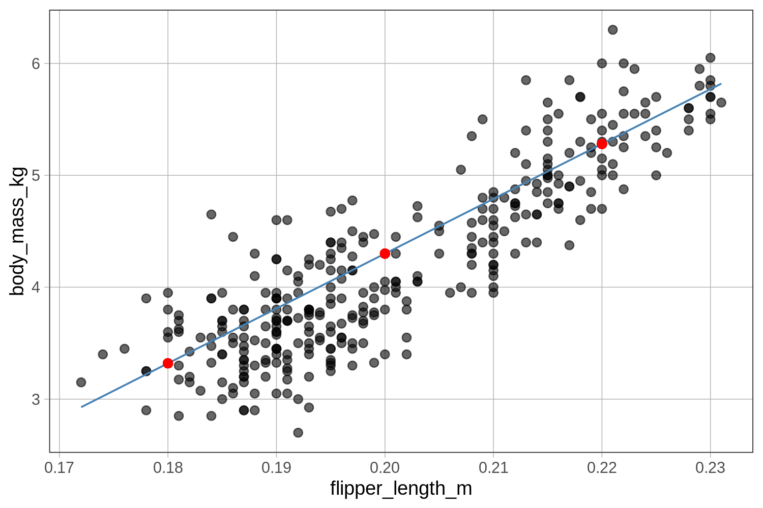
Use the code window below to add three red dots to the scatter plot that represent the body mass predictions for penguins with three different flipper lengths (0.18, 0.20, and 0.22). We have also included code to graph the function as a line. Where do you think the predictions will fall relative to the function?
require(coursekata)
# this creates our custom function
our_function <- function(X){-5.5 + 49*X}

# add the three predictions to this graph
gf_point(body_mass_kg ~ flipper_length_m, data = penguins) %>%
  gf_function(our_function, color = "steelblue")
# this creates our custom function
our_function <- function(X){-5.5 + 49*X}

# add the three predictions to this graph
gf_point(body_mass_kg ~ flipper_length_m, data = penguins) %>%
  gf_function(our_function, color = "steelblue") %>%
  gf_point(our_function(0.18) ~ 0.18, color = "red") %>%
  gf_point(our_function(0.20) ~ 0.20, color = "red") %>%
  gf_point(our_function(0.22) ~ 0.22, color = "red")
ex() %>% {
  check_function(., "gf_point", index = 1) %>% {
    check_arg(., "object") %>% check_equal()
    check_arg(., "data") %>% check_equal()
  }
  check_function(., "gf_function") %>% {
    check_arg(., "object") %>% check_equal()
  }
  check_function(., "gf_point", index = 2) %>% {
    check_arg(., 1) %>% check_equal()
    check_arg(., 2) %>% check_equal()
  }
  check_function(., "gf_point", index = 3) %>% {
    check_arg(., 1) %>% check_equal()
    check_arg(., 2) %>% check_equal()
  }
  check_function(., "gf_point", index = 4) %>% {
    check_arg(., 1) %>% check_equal()
    check_arg(., 2) %>% check_equal()
  }
}